Veikkausliiga
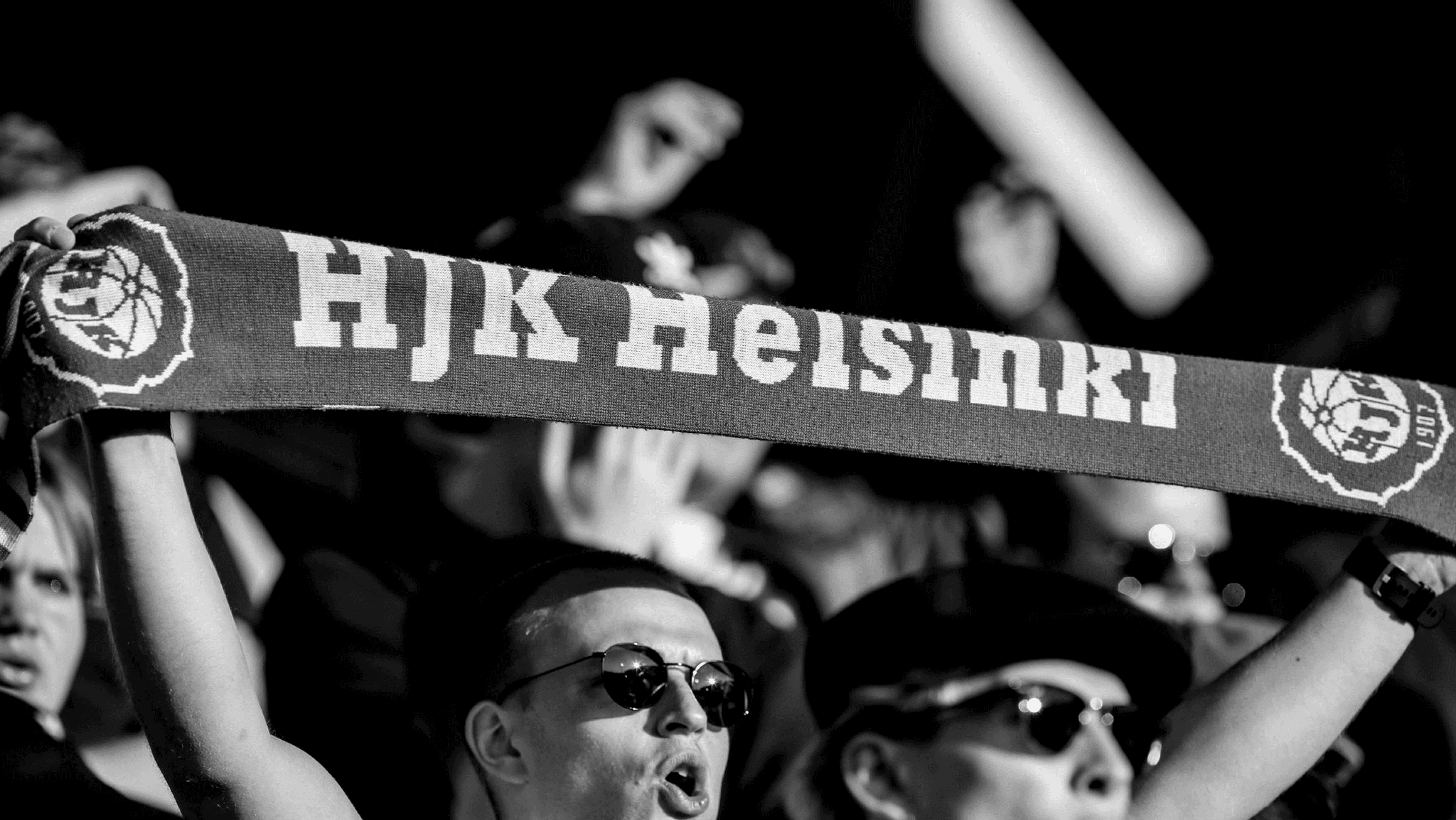
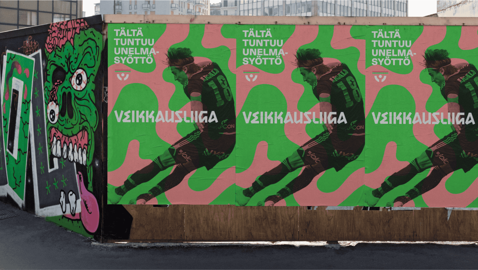
What's more football than your fan scarf?
Contributions
Brand Identity, Brand Narrative, Brand Platform, Brand Voice, Logo Design, Motion Design, Type Design
Industry
Sports, Entertainment
Awards
Silver, Vuoden Huiput, 2026
Impacts
Record-breaking attendance in 2025, surpassing decades-old league records
Press
Veikkausliiga is Finland's highest level of professional football. A league shaped by long distances, changing seasons and some of the most committed supporters in the game.
Bond was asked to create a new identity for the league. One capable of uniting twelve clubs, strengthening the league's profile internationally, and expressing something distinctively Finnish at the same time.
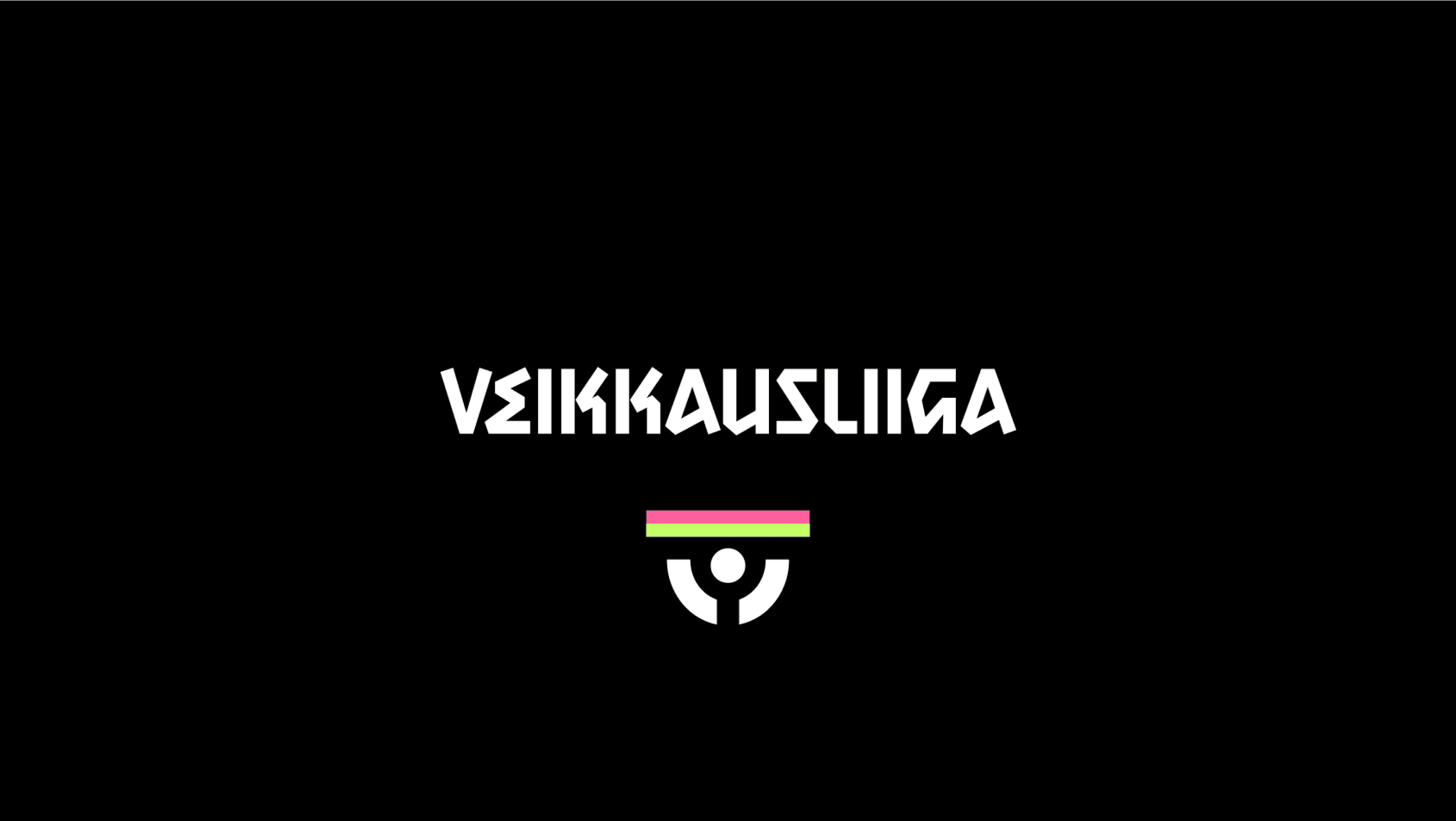
What emerged was not a new symbol. It was a familiar one, seen differently.
The supporter’s scarf has long been one of football's most universal objects. Raised above heads in celebration, wrapped tightly against spring snow and autumn rain, it represents loyalty, belonging and shared experience. It was already present in the previous Veikkausliiga logo. We simply followed it further.
From this came a single organising idea: football as the exception to Finnish restraint.
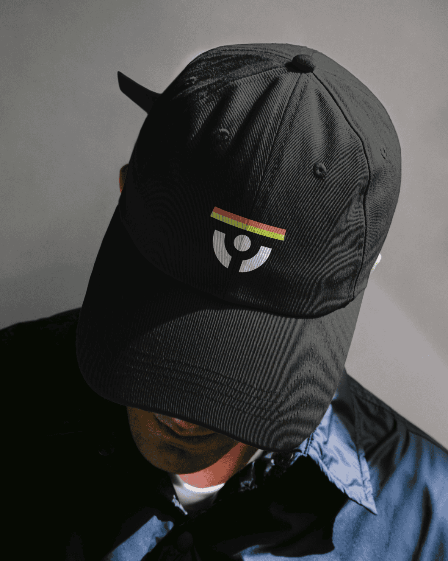
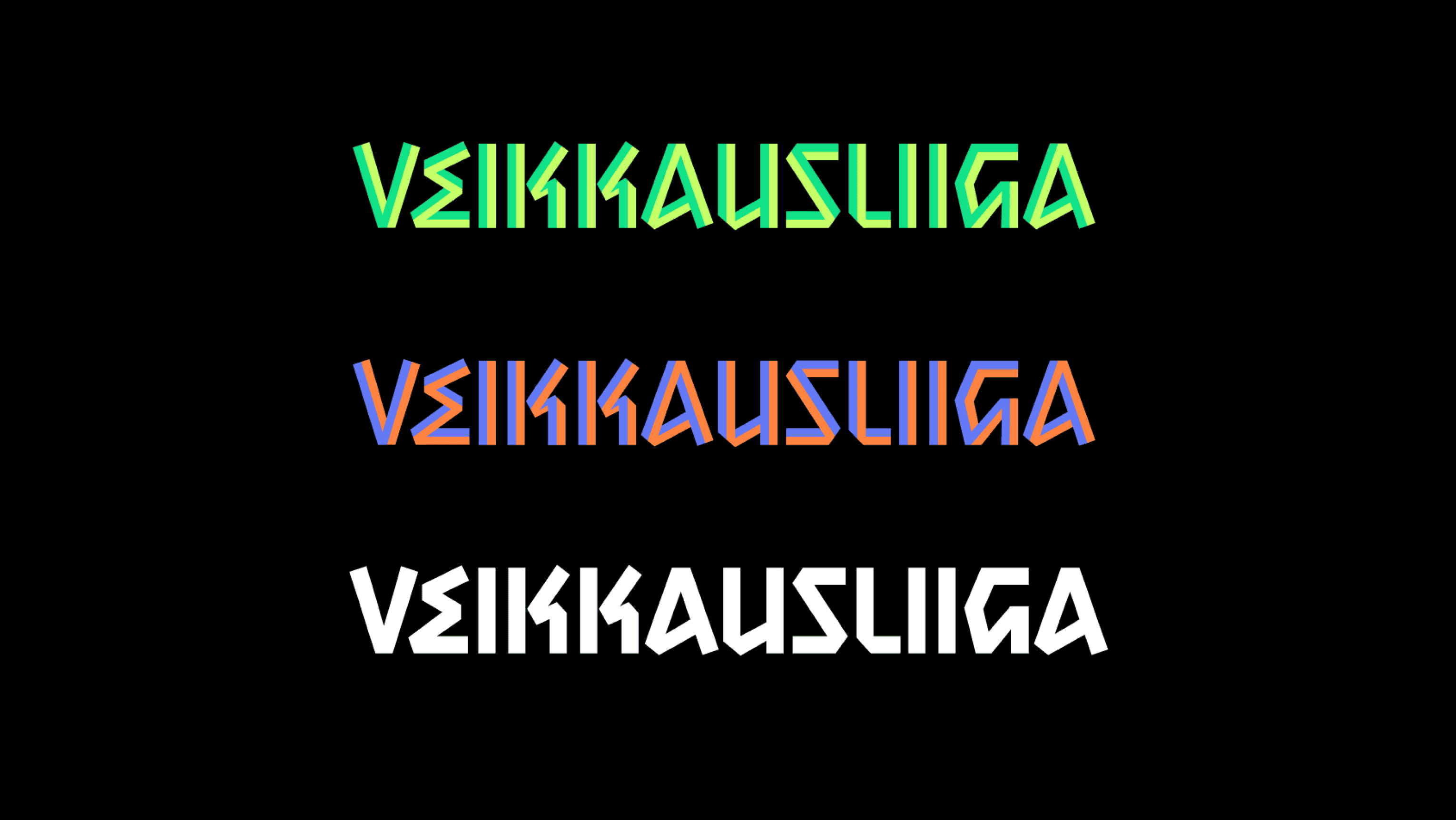
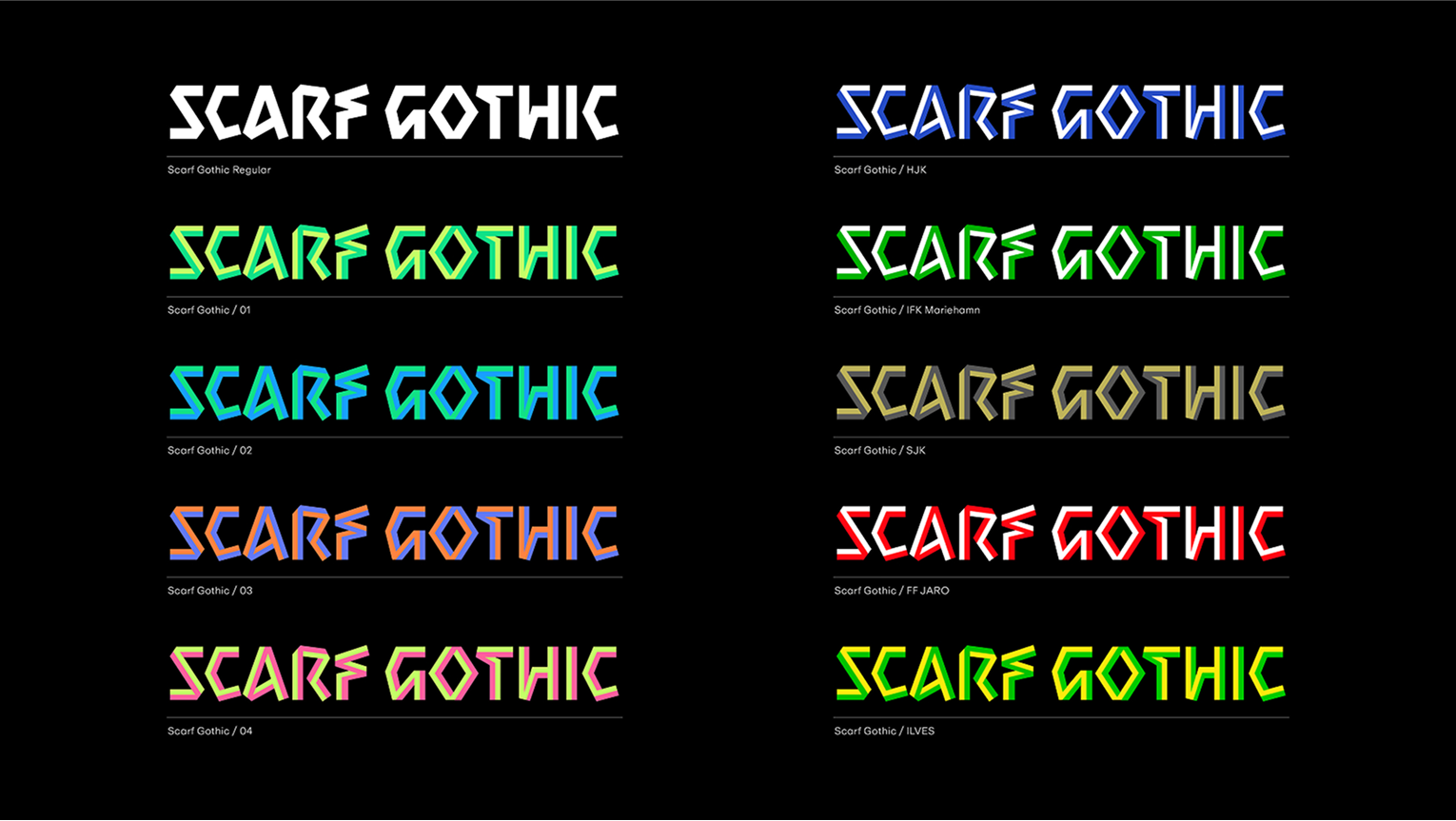
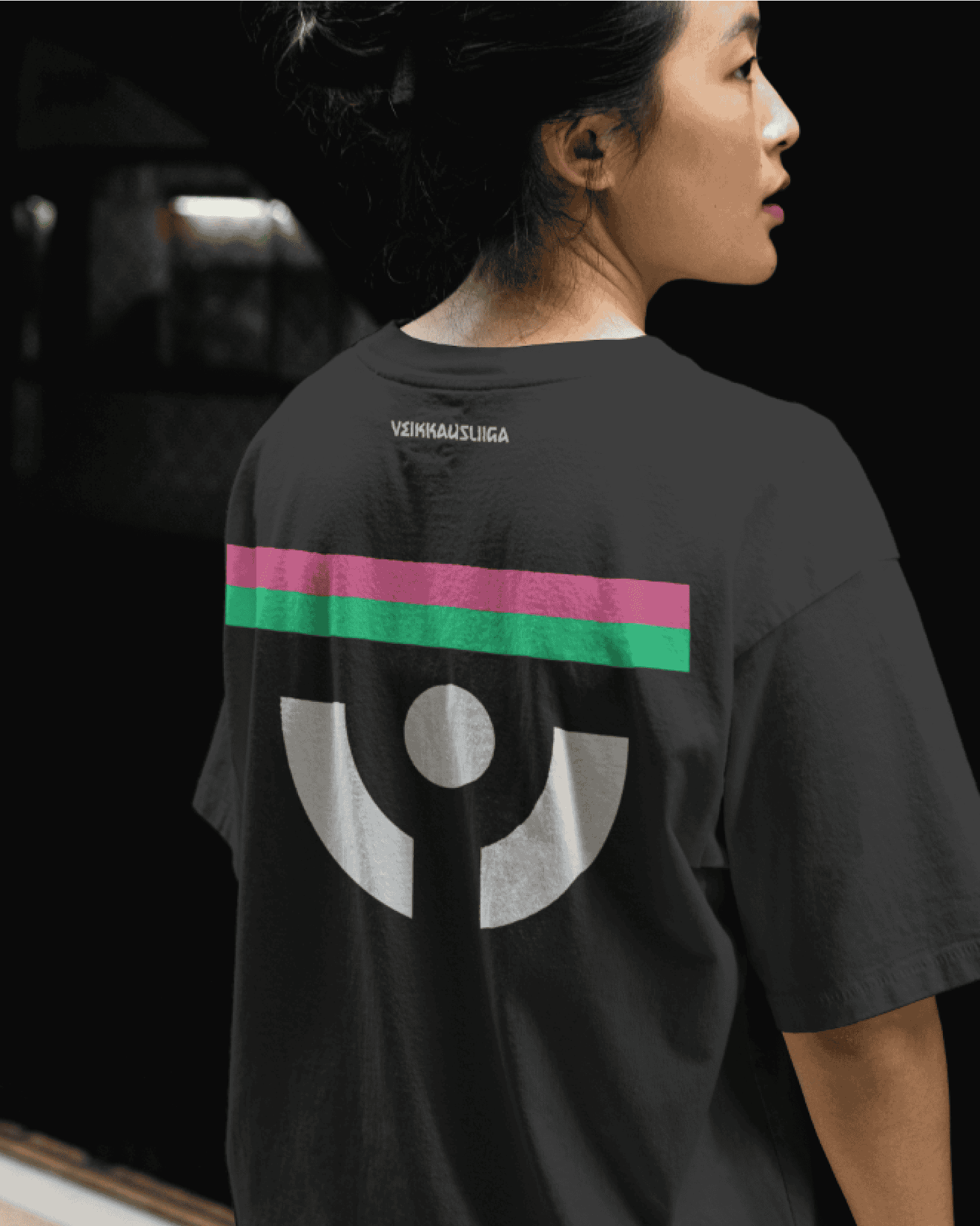
The identity follows the same logic. The scarf became the emblem, the emotional centre of the brand, and the foundation of a custom typeface, Scarf Gothic, whose letterforms are shaped by the folds of fabric itself. The colour palette draws together the identities of all twelve clubs, creating a league brand that feels collective without losing individuality.
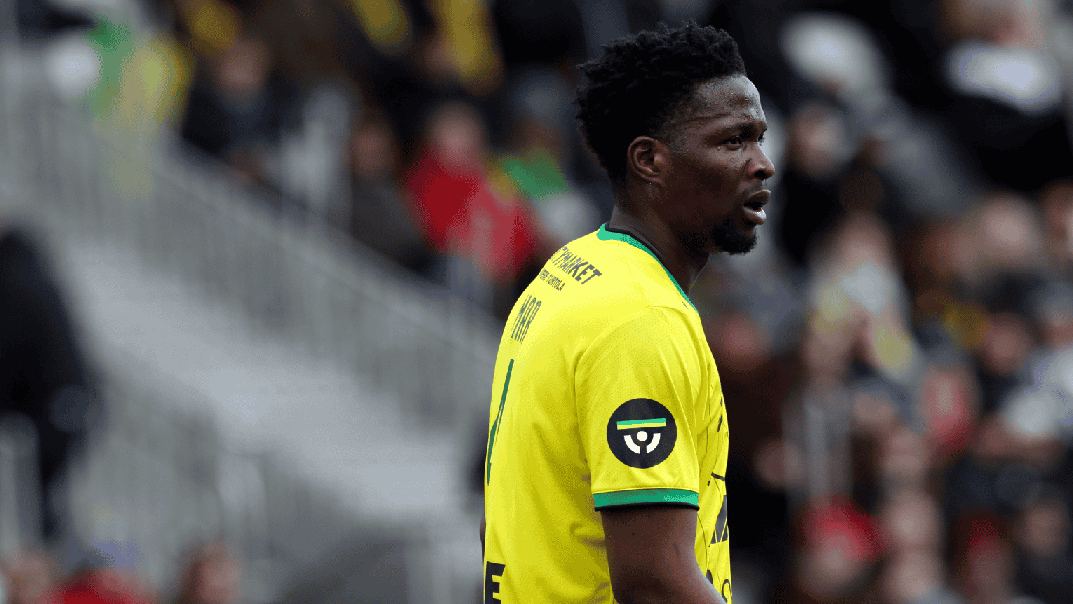
The commercial result was clarity. A league identity capable of supporting clubs, broadcasts, partnerships and merchandise through a single recognisable system. In 2025, Veikkausliiga recorded its highest average attendance in the modern era, surpassing records that had stood for decades. Growth was also seen across broadcast audiences, media coverage, social visibility and overall public interest in the league.
The strongest identities rarely begin with invention. They begin by recognising what people already care about, and giving it a form powerful enough to bring them together.
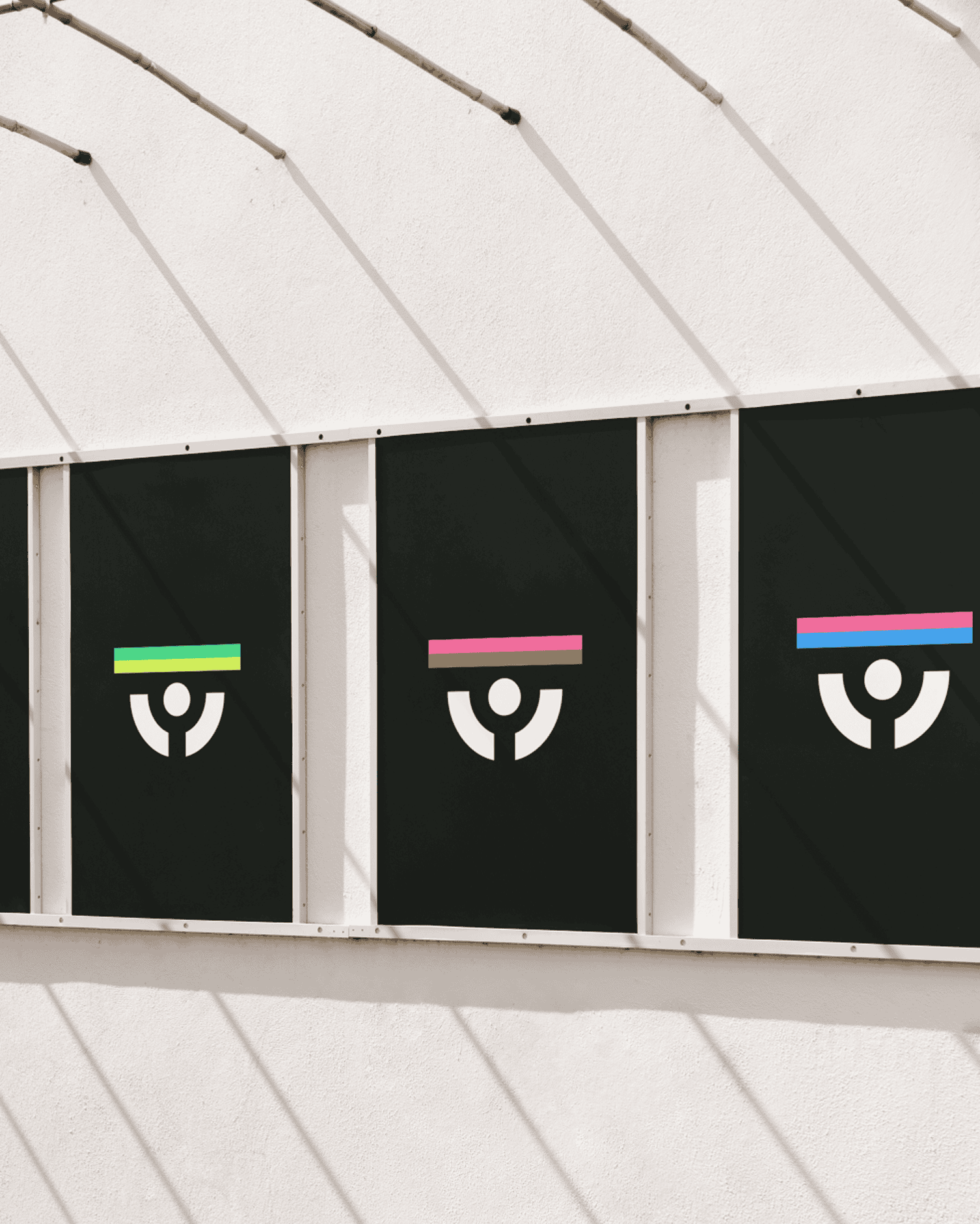
The Symbol
Scarf Gothic letterform inspiration
Logotype
Scarf Gothic, a custom typeface for Veikkausliiga
This is how yellow and green feels like. / This is what the race to the championship feels like. / ...
This is how last minute equaliser feels like. / This is what it feels like to be among your own. / ...
Multicolored symbol paying tribute to Veikkausliiga’s clubs

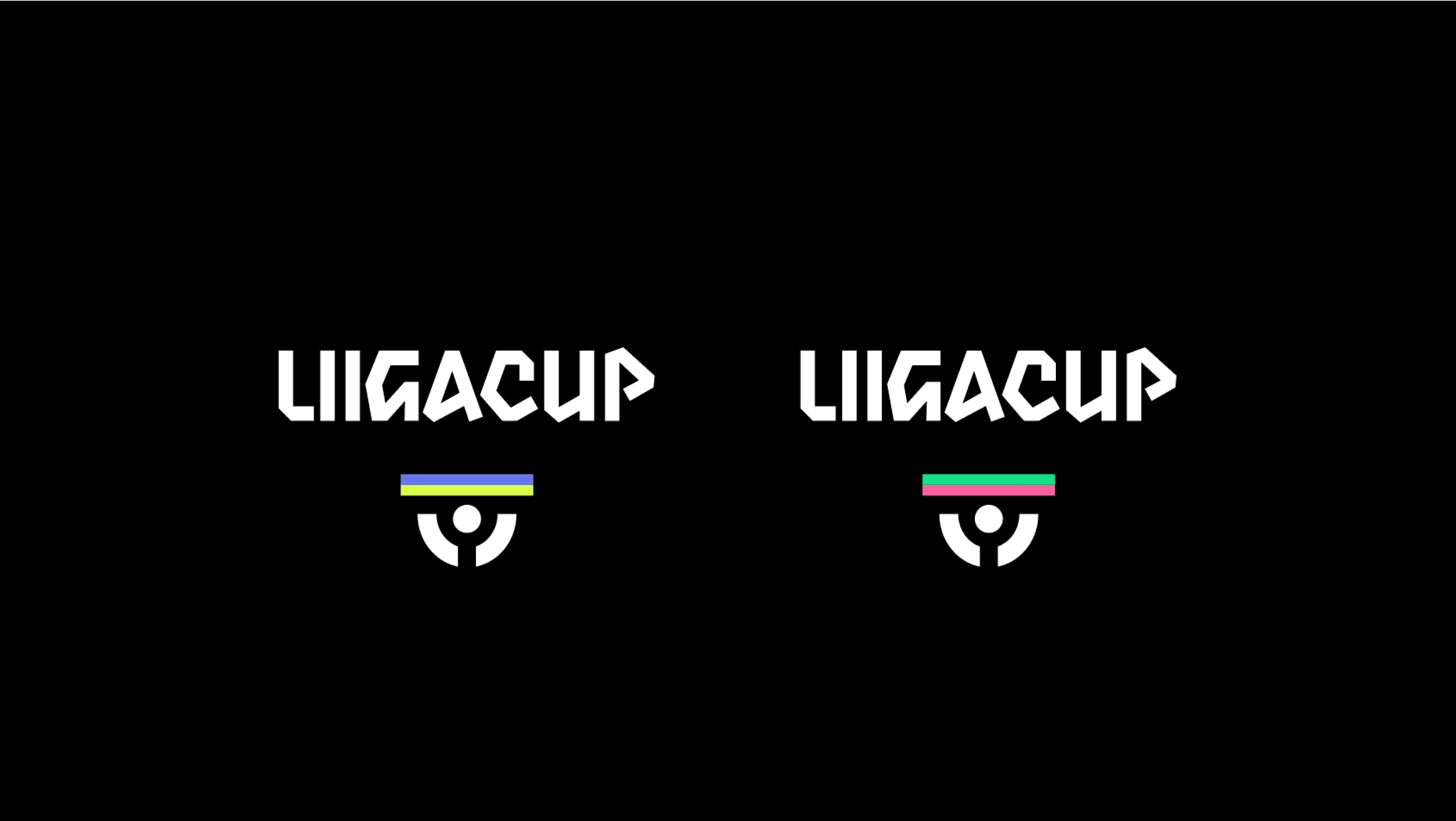
Sub-branding; The Finnish League Cup
“Football is not just about the game; it’s about the people, the emotions, the shared moments that stay with us. This new identity honors that connection and ensures Veikkausliiga remains at the forefront of Finnish sports, delivering a powerful and deeply felt experience for all.”
Nicolas Prieto
Commercial Director, Veikkausliiga