Vaya!
Fairmont Hotels, Accor
Designing a hotel restaurant full of life
Contributions
Brand Naming, Brand Narrative, Brand Identity, Brand Design
Industry
Hospitality, Luxury, Destinations
Credits
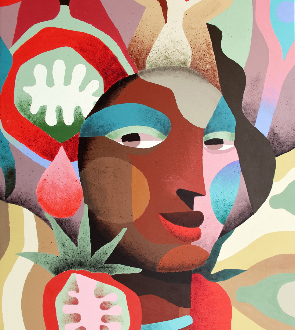
Artwork by Pedro Rogerio
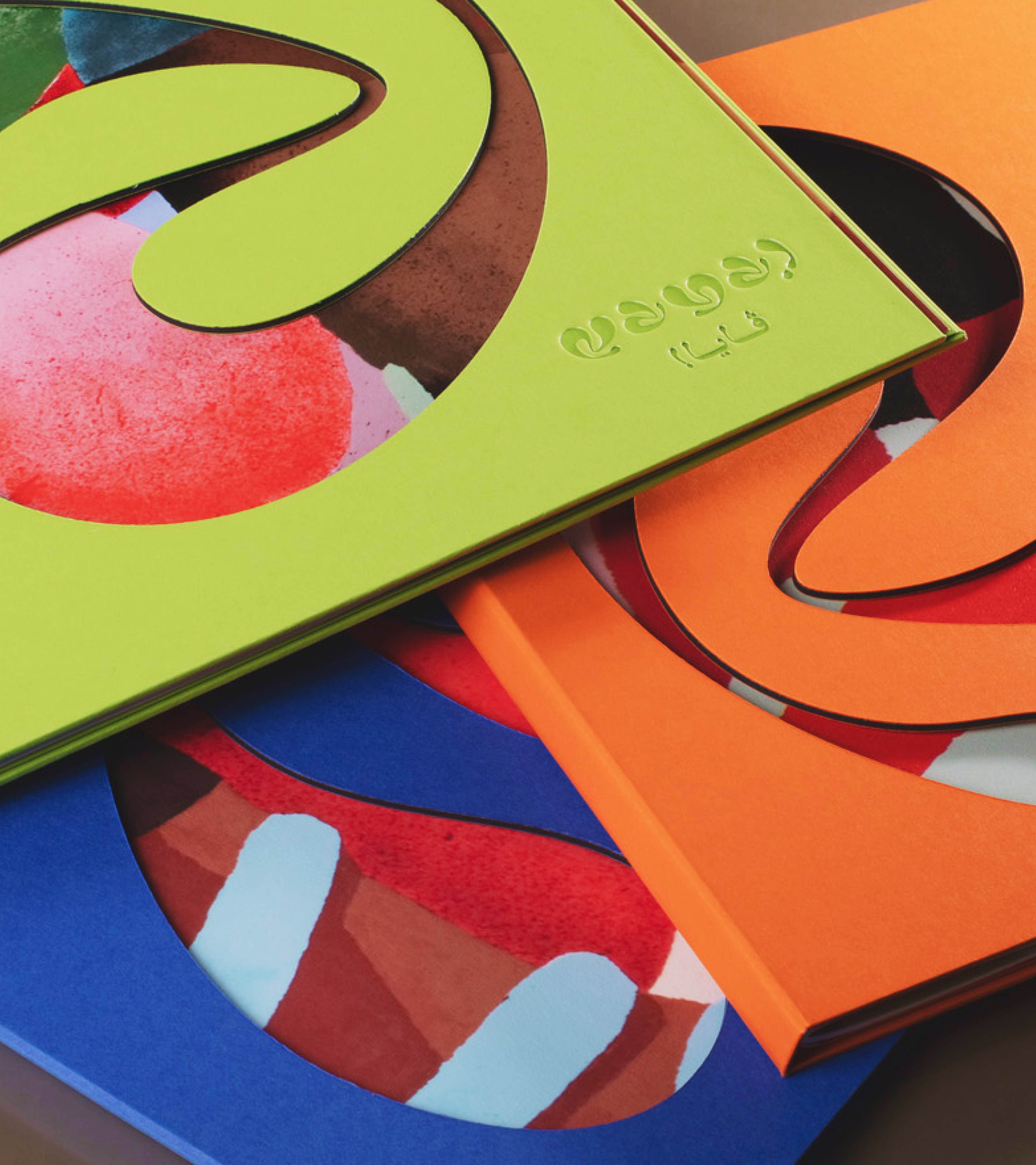
Prints by Imprimerie du Marais
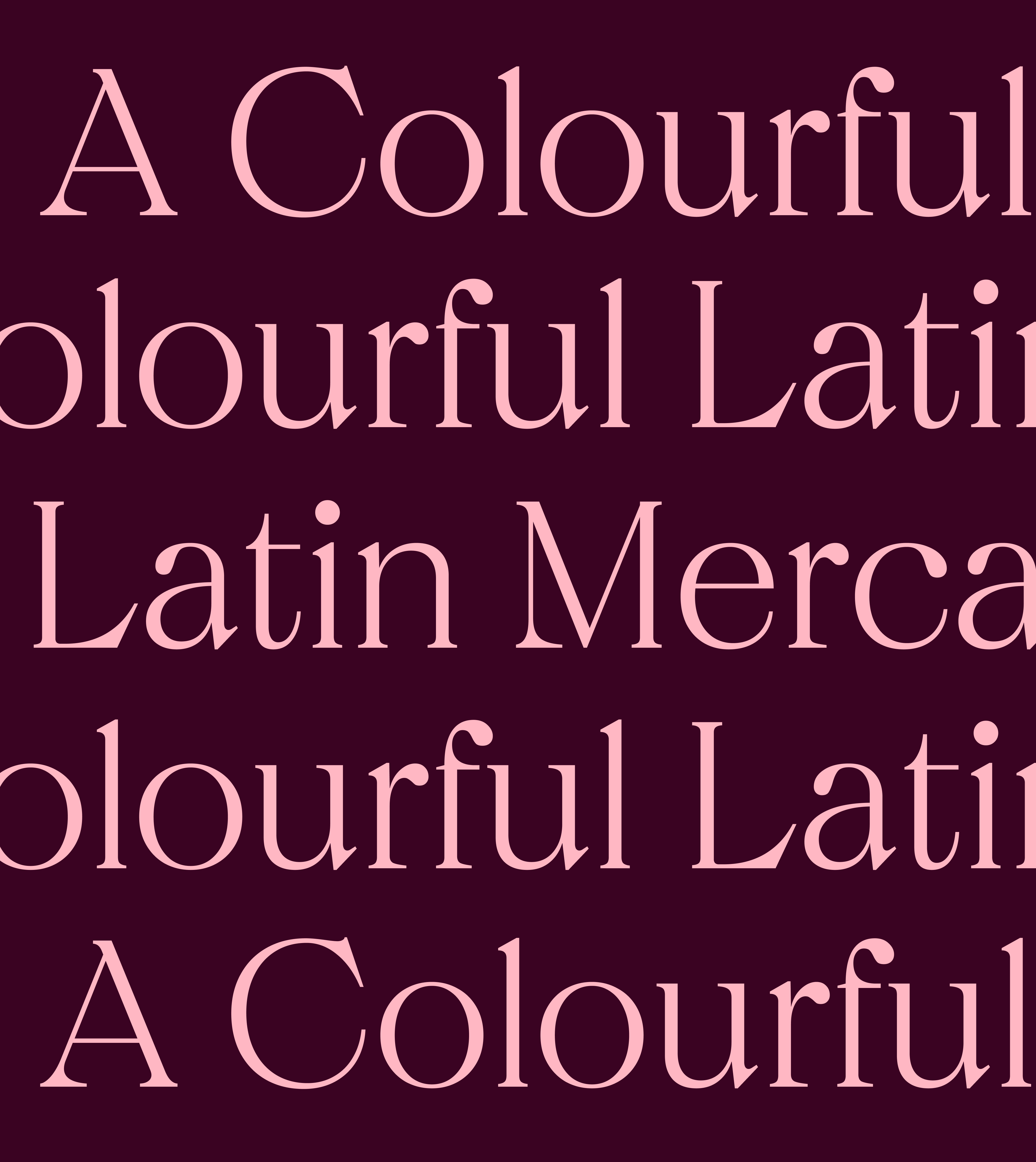
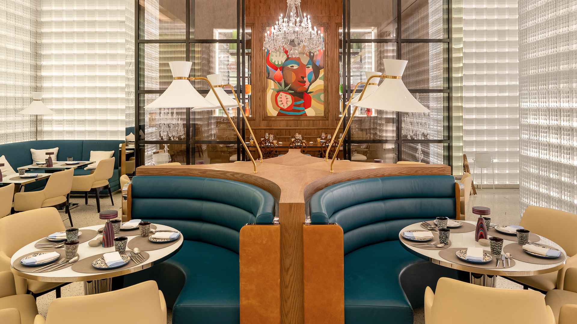
All-day dining restaurants in luxury hotels often fall into the same trap: generic interiors, predictable experiences and little to distinguish one from another. Too often, they become forgettable spaces rather than destinations in their own right. Within the extraordinary setting of Katara Towers in Doha, the ambition was to challenge that convention and create something full of vibrancy, personality and life. Vaya! was conceived as a Latin American mercado: a place alive with food, colour, art, sound and the energy of the street. Rather than another hotel restaurant, the opportunity was to create a destination with its own distinct character, atmosphere and reason to visit.
Inspired by the spirit of a Latin American marketplace, the starting point was its spontaneity, expressive art and vibrant social life. Rather than relying on familiar restaurant clichés, we looked to these qualities to build a world that felt original, immersive and full of personality.
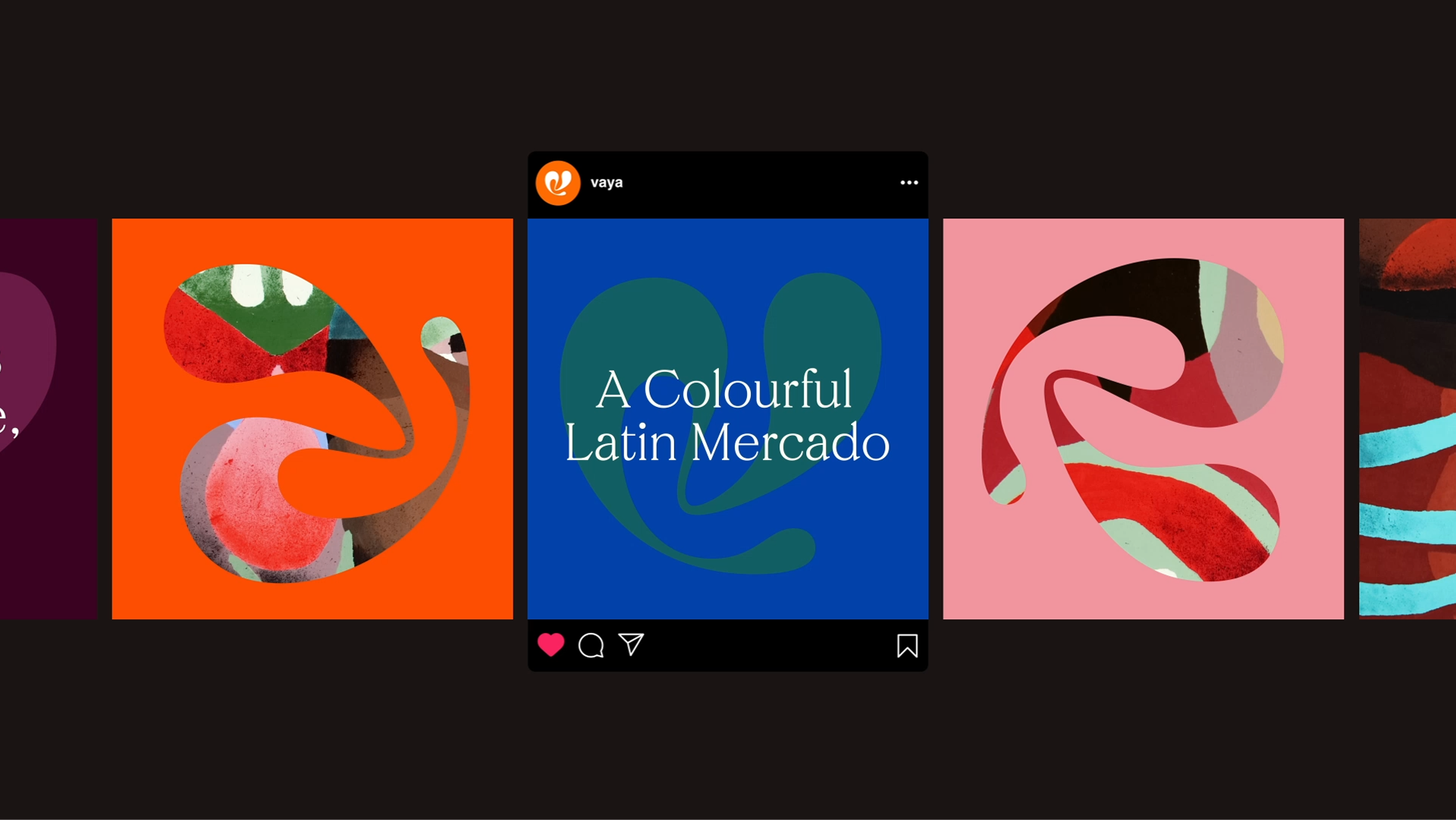
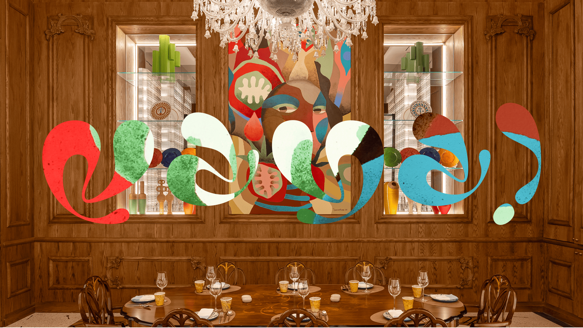
Vaya! was the name that captured that spirit. An invitation to move, explore and experience something new, it became the foundation for an identity built around a single custom letterform, twisted and flipped to create the V, A and Y. One form became three letters, giving the brand a visual rhythm and an unmistakable sense of movement.
Art became equally central to the experience. Expressive work by Brazilian artist Pedro Rogerio was integrated into the backgrounds of the letterforms to create a colourful, energetic feel, then reinterpreted across menus and other touchpoints. Together, these elements created a visual language that could only belong to Vaya!: bold, playful, imperfect and full of life.
Designed to work as a complete destination experience, the identity extended from the restaurant environment to communications, social media and a range of marketplace merchandise. Every detail offered another opportunity to express its character.
Menus became an especially tactile expression of the brand. Working with French luxury print house Imprimerie du Marais, breakfast, lunch and dinner menus each received their own colour, incorporating artwork, die-cut pages, hardcover construction, clear foil, blind debossing and carefully selected papers. Arabic and English editions were individually considered, with their construction adapted to the direction in which each menu opened.
What emerged was a distinctive dining destination within one of Doha's most ambitious hospitality landmarks. More than a restaurant identity, Vaya! became a world of its own, transforming the often-overlooked all-day dining experience into something memorable, while bringing the expressive energy of a Latin American mercado into the luxury hotel setting without losing its spontaneity, individuality or sense of fun.